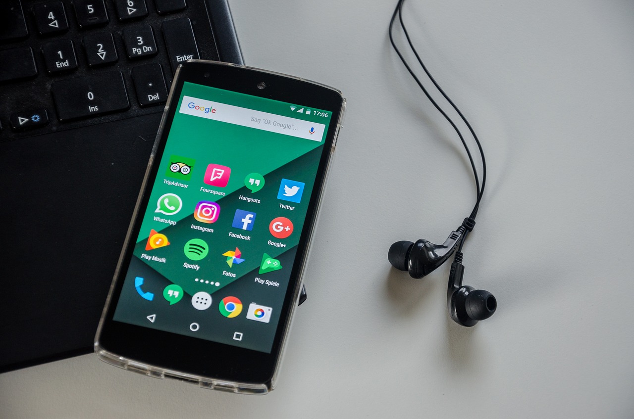
Smartphones are everywhere nowadays, many of us even know people who have 2 or 3 of them, so developing apps has become a very important skill for developers, but oftentimes we don’t think who is using our apps, let’s take a look at some tips to make our app reach more and more people.

Often times, developers tend to think functionality first when developing an app, the app should work and do everything it needs, when it is done, we start to think about fonts, colors, image sizes, placements, etc. This, obviously, leads to an extended time to design the app and adjusting it to the functionality. You might be familiar with Android’s Material Design, which includes a lot of Accessibility guidelines and tips for Android Developers.
In the Android Developers’ site you can find some guidelines on how to make your Apps more accessible, but let’s go over some interesting ones.
Consider Talk Back
- What is talk back? you might ask, it’s a screen reader, it reads aloud the contents of the screen for users that have visual problems.
- How it helps our app? Consider how talk back works, it reads from top to bottom following the design of your Activity’s Layout, it also reads descriptions you added to images and image buttons. If you design your layouts with this in mind, you can create activities that have a better reading flow, you can identify important images, and even realize when a View or Component should go in a different position.
Don’t rely only on color cues
- What do we mean by this? For example when designing a form, or a login screen, you might be tempted to use a simplistic approach, make a couple circle buttons, and use colors to differentiate them.
- Why is this a problem? First consider color blind people, if you go with a green-red color scheme, they will have problems using your app, and will probably uninstall very quickly. Other than color-blind people, if you decide to use your App’s color scheme, suppose your App’s primary color is Red, your Accept buttons are red, and to add some contrast you decide to use blue Cancel buttons, instinctively, some people might think the Red button is the Cancel button. To avoid this, always try to use (representative) images, labels, or captions on your buttons.
When developing Apps, thinking about Accessibility can help us get a feel of how users see our App, of course, field testing cannot be replaced, but having a good design from the start can save us lots of development time.
There are several more tips to consider, and there’s a reason the Android team pushes so hard for Accessibility, you can check Google I/O 2017, 2018 and 2019 talks on accessibility to see how it has changed and evolved over the years.
Android even offers an Accessibility Scanner, which can help you determine in which areas your app might need improvement
So next time you’re working on an Android App, consider designing the UI first, or at least not leaving it until the last moment!
Author: Ing. Erwin González


