In the past, we have mentioned some recommendations for starting Android developers, and have also discussed about the Design Thinking process.
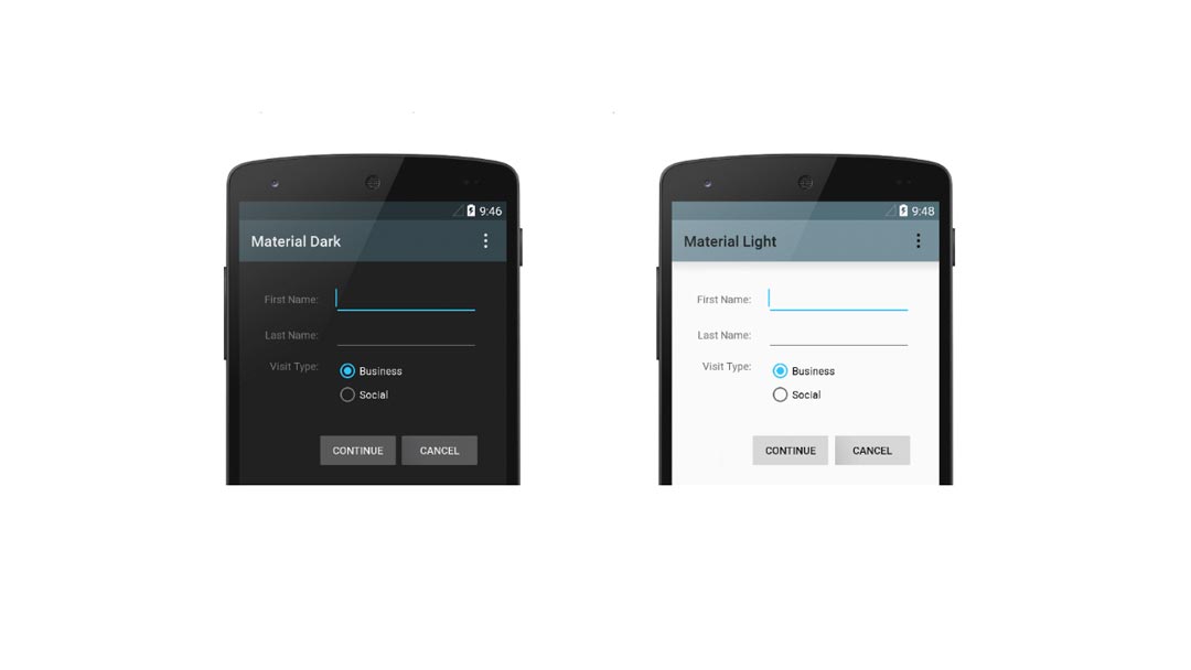
However, it is time we talk about Google’s guidelines about the classic principles of good design on apps: Material design.
So, What is Material Design?
Material Design was announced at Google I/O conference in 2014. It is a design language used for Android devices. An integral guide for visual design, movement and interaction on different platforms and devices, that was originally known by the codename Quantum Paper.
On the “Material Design – Introduction” guidelines, Google explain its main goal: “Create a visual language that synthesizes classic principles of good design with the innovation and possibility of technology and science.”
Google itself is in the process of ensuring that all of their products provide a consistent experience with Material Design as the fundamental basis.
Conceptually, Material Design is based on real world materials; Using shadows and lightning to create depth and edges, making elements respond in a similar way to how we would expect them in real life.
The principles and foundation of Material Design
There are three core principles specified in Google’s Material Design guidelines:
- Material is the metaphor:
A material metaphor is composed by a system of motion and rationalized space, both of these elements compiled in an unifying theory.
- Bold, graphic, intentional:
Visual treatments are guided by the foundational elements of print based design:
typography, grids, scale, color, and use of imagery.
- Motion provides meaning:
The main characteristic of this principle is that all actions take place in only one environment. Motion, in this case, respects and reinforce the user as the prime mover.
Material Design is a kind of hybrid design that in order to convey physical space is composed by the addition of drop shadows and gradients.
Its foundation is rooted in what is commonly known as Flat Design in terms of minimalistic functional purposes (clean and open spaces, bright colors, etc), however, Material Design exists in a 3D environment, relating with each object in an X,Y and Z dimension.
In case you’re wondering if Material Design truly matters, the answer is: Yes, good design matters! And it begins with the realization that you’ll be successful in part with the help of an attractive and easy-to-use product.
Why consider Material Design for app development?
For developers, Material Design provides new tools that make it easier to build usable apps that also look good.
One relevant characteristic in Material Design is the facility to adjust to different screen sizes across mobile apps and devices, promoting consistency.
To acquire this consistency, following the spaces rules and work on the structural grids and consistent visual elements is necessary.
To designers and app developers following these principles means to creating a better user experience in mobile apps design, building scalable apps, familiarity and comfort among users.
With three years behind, Material Design continues to evolve, just as the operating system has done. In may 2017, Google introduced a library of material components for application building.
And with the advent of Android 8.0, Google has updated its style guide for developers.
Surely, Material Design will continue to influence all users of Google products and services. The advantages of these resource are useful in the app development process and they especially benefit User experience.

